Website Navigation - an often overlooked part of a Small Business Website Redesign
When did you last think about your website's navigation structure and placement?
Many people don't put much thought into this anymore. Notice how many websites now feature the mobile "hamburger" menu, even for people viewing sites on laptop or desktop computers?
But effective navigation is one of the most essential parts of having a successful website, leading to increased site visits and sales.

Why? Simple. People are far more likely to return to websites that are easy to navigate than websites where they spend too much time searching for information or products they are looking for.
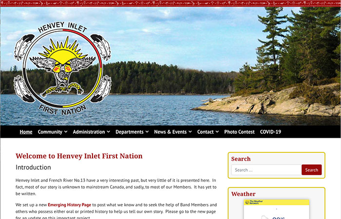
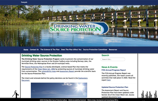
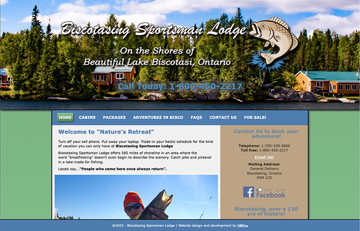
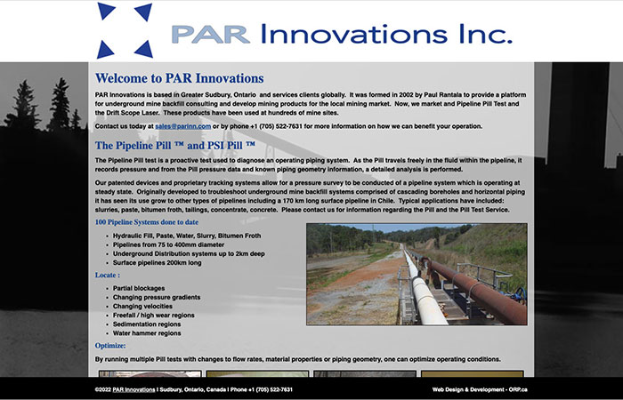
Typically, someone can find a website's navigation menu above or below a website's banner. It can be set to a sticky position, meaning the menu stays at the top of the screen when people scroll through your website content.
Some people place their website's navigation to the left or right side of their site, although this is less common than it used to be.
However, websites with multiple sections and hundreds of pages often have top and side menus.
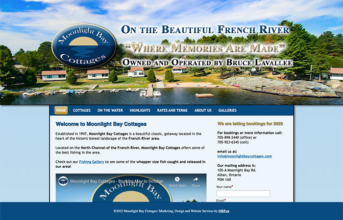
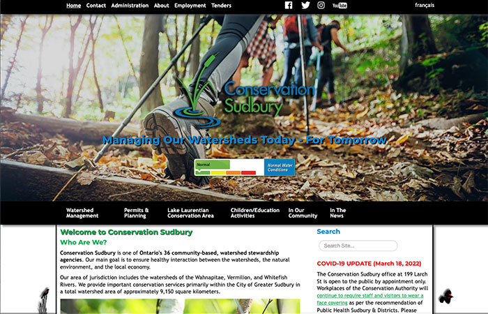
Having your menu above your banner image is a good idea. It's easy to find, and because it is not overly familiar, it stands out positively.
But if you have drop-down menus, then it can be difficult for visitors to use your navigation system effectively if the banners are animated. Moving images behind a drop-down menu can be complex for some users, especially if they have vision problems.
The age of your target audience is important too. Younger people like the hamburger menu because it looks similar to the menu on their phones.
Older visitors, especially those of us still in denial about needing glasses, will appreciate slightly bigger menu text and a complete navigation area on the laptop version of your website.
This article brushes the surface of everything to consider when deciding where to place your website navigation system and how it should look.
We always ask clients to look at different websites and make a list of things they like. Make sure you look at those websites' navigation is presented.
Don't let your website hold you back. Fill out the contact form below to see how decades of experience in small business website design and digital marketing can help you create a beautiful and functional website.
{rsform 3}

